Emergency alerts NDA, client name withheld
In the emergency alert system, a lower threshold covers more threats and may mean more notifications, while a higher threshold limits them to more serious alerts. I designed onboarding that explains the consequences of each setting as residents make their choices.
- My role
- UX/UI at bluesBrackets, with a particular focus on onboarding. I led workshops, analysed requirements, and designed the information architecture, user flow, interface, and content. I agreed on solutions with the client and developers.
- Outcome
- A working version delivered to the client. The mobile MVP required an internet connection.
Technical documentation was the starting point
The starting point was an admin panel, initial materials, and a single mockup. We began with workshops and an analysis of the supplied emergency alert documentation, which described threat categories and severity levels, among other details.
My task was to use this structure to design the setup experience for residents. We also agreed that the app needed to accommodate older people and those less comfortable with technology, so I designed large interactive elements, legible text, and explanations of the settings.
From finding a place to choosing the alert area
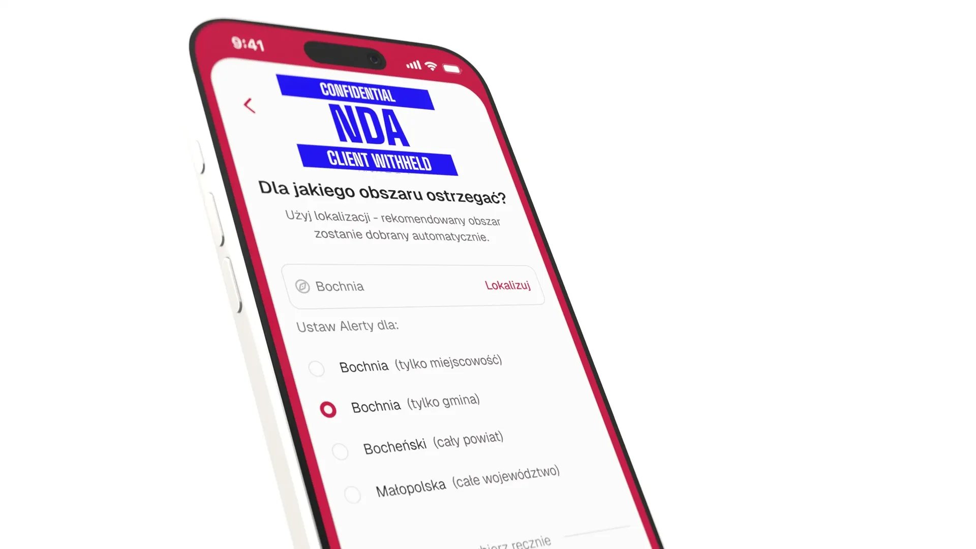
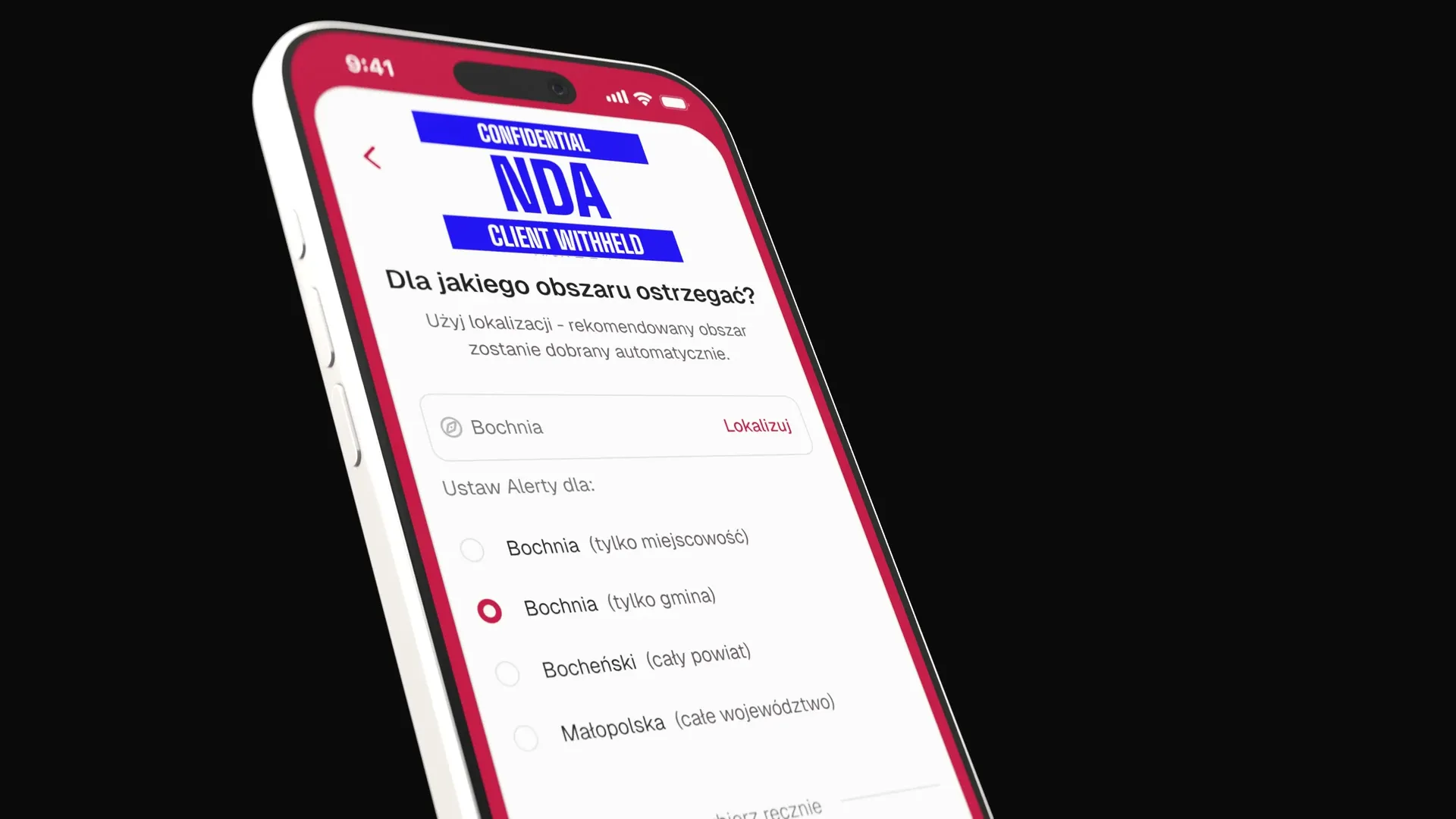
Choosing a location could require searching a hierarchy from a region (voivodeship) through a county to a town. I also designed a path that uses the phone's location.
After finding a place, the user chooses the area they want to cover, such as a town, municipality, county, or region. The interface explains the difference between these areas. Several locations can be selected, while manual selection remains available.
Seven groups replaced a list of technical codes
The documentation included many detailed threat types and seven main groups. I based the category selection on these existing groups.
Residents can select all groups or choose the ones relevant to them. This allowed the setup to focus on the meaning of each category without bringing the full list of technical codes into the interface.
Cards explain what each selected level means
We considered a vertical slider with the threat level on one side and notification frequency on the other. The problem was that these relationships move in opposite directions: lowering the threshold expands the range of alerts, while raising it narrows the range.
I proposed three cards: All alerts, Important only, and Critical only. Each card describes the scope of the choice, so the explanation appears next to the setting the user is currently selecting.
Collected feedback informed design iterations
The feedback we collected informed subsequent design iterations. It helped refine subsequent versions of the solution.
Developers built the app from the design and filled in some UI details after discussing the design direction with me. The team delivered a working version to the client that required an internet connection. In another iteration, I would focus on the main alert view and the legibility of the map.