Kcalmar: one meal plan, two perspectives
I designed Kcalmar Pro for dietitians, along with mobile and web products for patients. For dietitians, I worked on tools for creating meal plans and managing dishes. For patients, I designed access to the prepared plan and shopping list.
- My role
- The first UX designer on the Kcalmar.pro team, from February 2021 to March 2024. I designed UX/UI for the existing platform, new features, mobile and web products for patients, and a foundational Design System. I worked with the PM, dietitians, developers, and a tester.
- Outcome
- Designs for platform modules, PDF templates, and the published patient app.
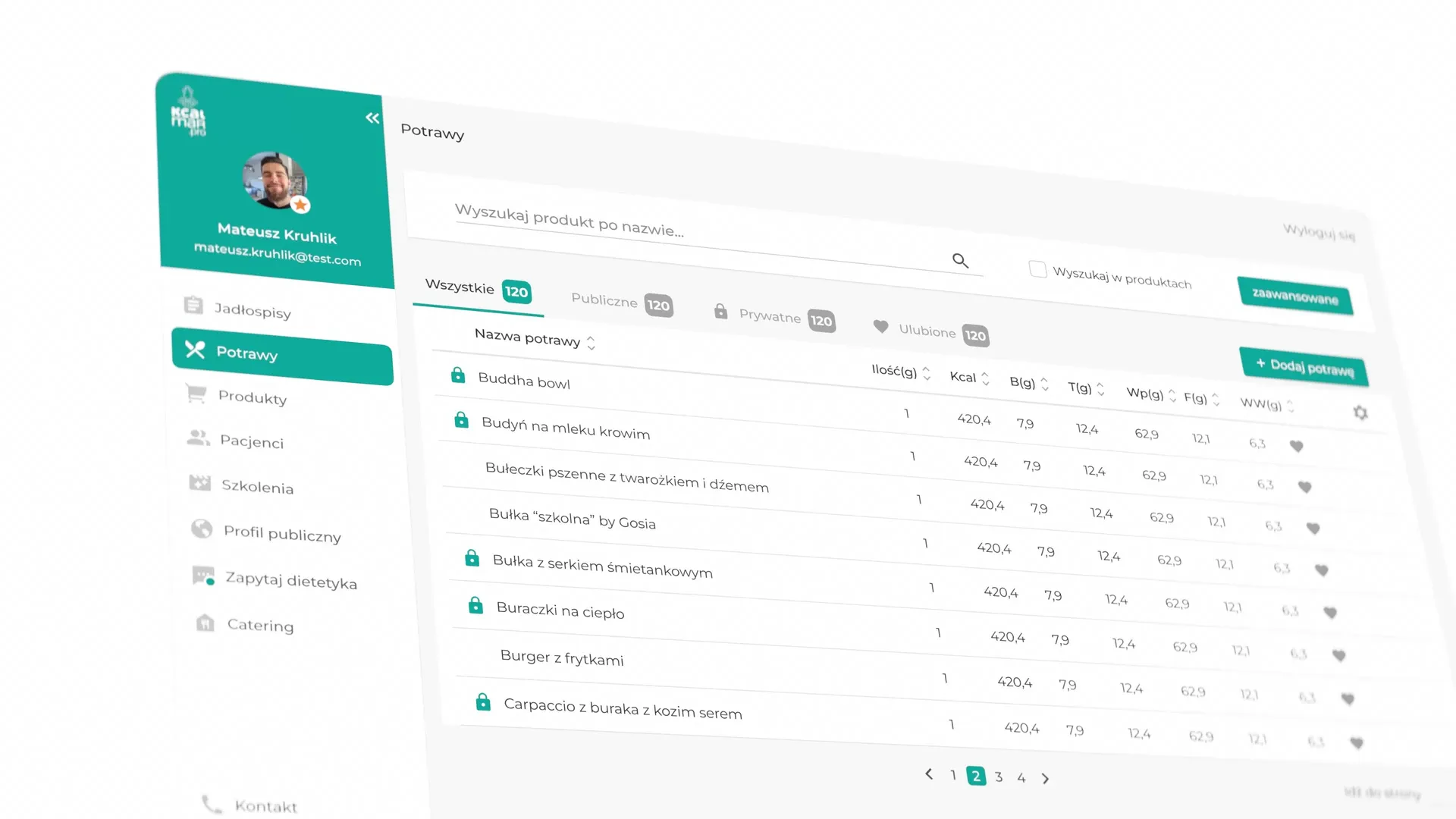
The redesign progressed alongside product development
Kcalmar already had a working tool for dietitians. The team received user feedback and continued developing new features. I joined to organise the modules and improve how people used the interface.
Conversations with dietitians on the team helped me understand their work. Together, we clarified which information should appear on each screen and how it was used when preparing a meal plan.
A dish brings ingredients, quantities, and preparation together
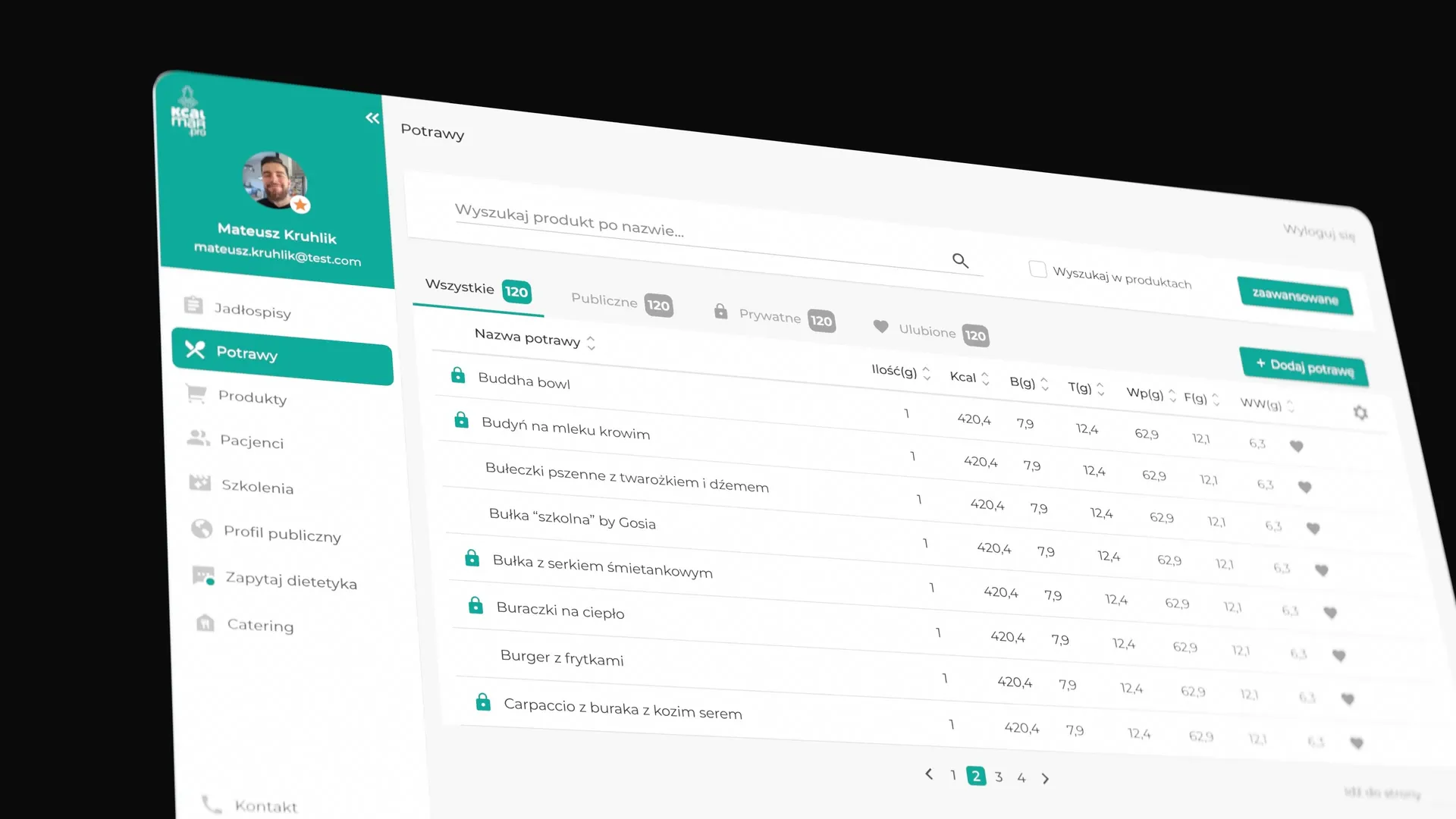
In Kcalmar Pro, I worked on tools used to prepare meal plans. The dish catalogue lets dietitians browse available items and their nutritional values. In the dish editor, ingredients, quantities, the number of servings, and preparation instructions are brought together in one view.
I also worked on diet catalogues, copying meal plans, the weekly view, and PDF templates. Clearly distinguishing meals, summaries, and notes was an important part of this work.
The patient app focuses on a specific day
The previous patient app had not been developed for a long time. We worked on a new version where patients could use the meal plan prepared by their dietitian. I designed how meals and daily comments were presented, as well as the iconography.
In the app, the main task was reading the plan for a specific day. In the dietitian's platform, the same information forms part of the work on the whole meal plan.
Patients can also use their meal plan in a browser
I designed the patient web app with the same feature set as the mobile app. I adapted the layout to the larger screen, keeping the meal list next to the selected dish, its ingredients, and preparation instructions.
The shopping list connects the meal plan to the products needed
I also designed the patient's shopping list. In the mobile app, products are arranged in groups and individual items can be checked off. In the web app, the list uses the wider space and a multicolumn layout.
A foundational Design System supported new features
I built a component library and visual rules to help keep the interface consistent. I also refined the colours, including darkening the product's turquoise colour to improve contrast.
This was a foundational Design System developed within a working product. At the time, I was learning how to prepare components the team could reuse for future features.
The handoff covered interface behaviour
I provided prototypes that demonstrated how interface elements should behave and clarified details as the team worked. A tester checked the implementation against Figma.
In later projects, I began to document interface behaviour more thoroughly and review the implementation with the team.