Canpol: controlling two breast pumps in one view
I designed an app for using one or two breast pumps, from connecting the device to saving a pumping session.
- My role
- The sole product designer on the bluesBrackets team. I handled research, user stories, user flows, UX/UI, content, and design decisions with the client. Developers handled implementation and Bluetooth communication.
- Outcome
- The Canpol app was released. Work on the separate Difrax app is ongoing.
Reviews revealed problems with connections and session history
Canpol needed an app for controlling a breast pump and viewing statistics. During workshops, we learned why the client wanted the app and which competing products they used as references. I analysed apps and reviews from the App Store and Google Play, organising what users valued, what frustrated them, and what they were missing. I supplemented this desk research with publications about pumping experiences and technology for mothers.
I turned the findings into user stories with acceptance criteria. They helped us agree with the client how the app should behave during pairing, pumping sessions, and data entry, and helped us close each part of the scope.
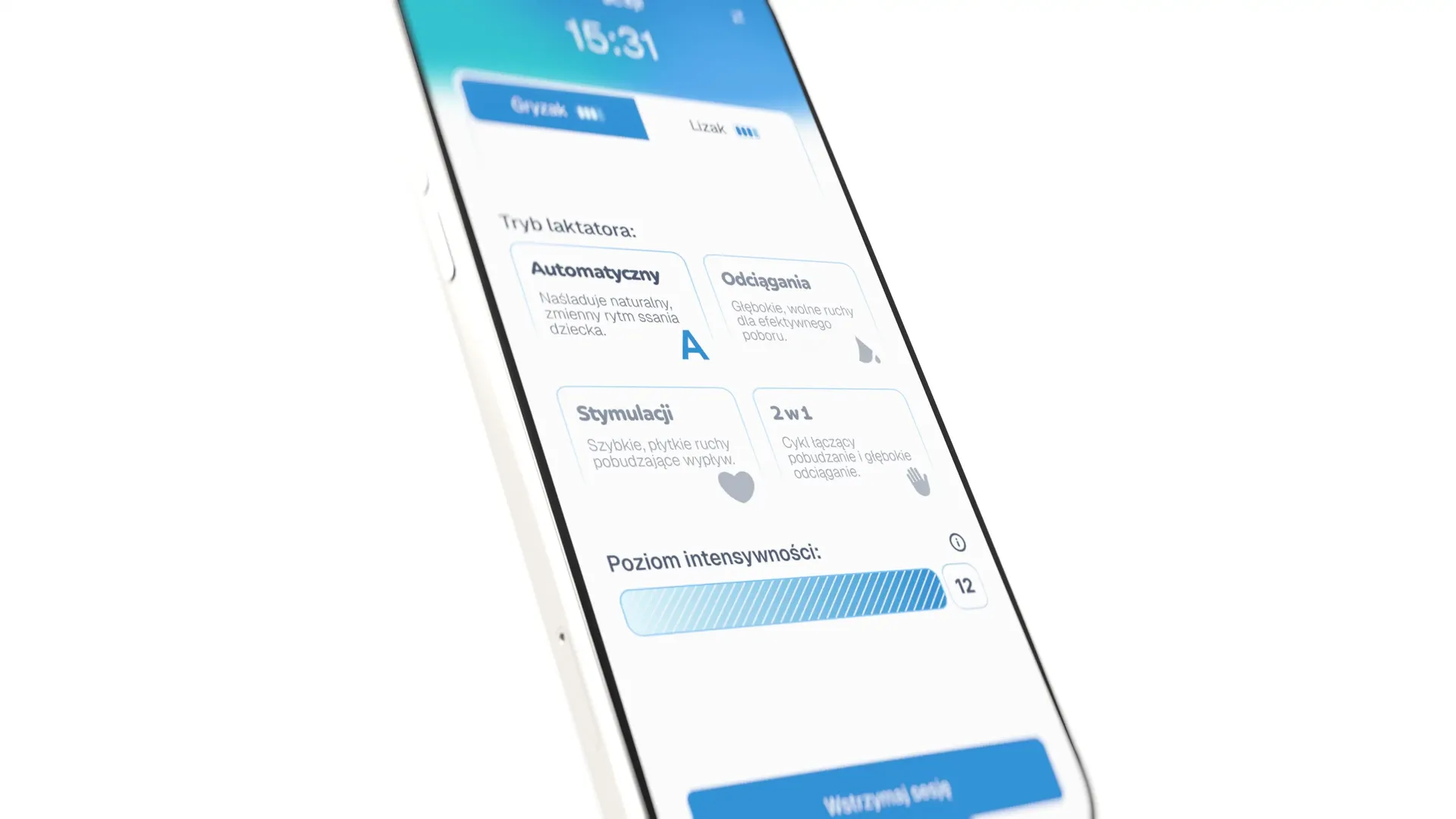
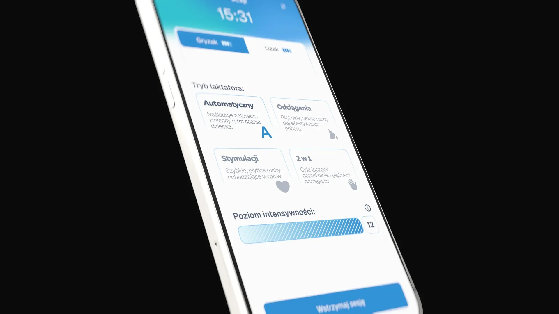
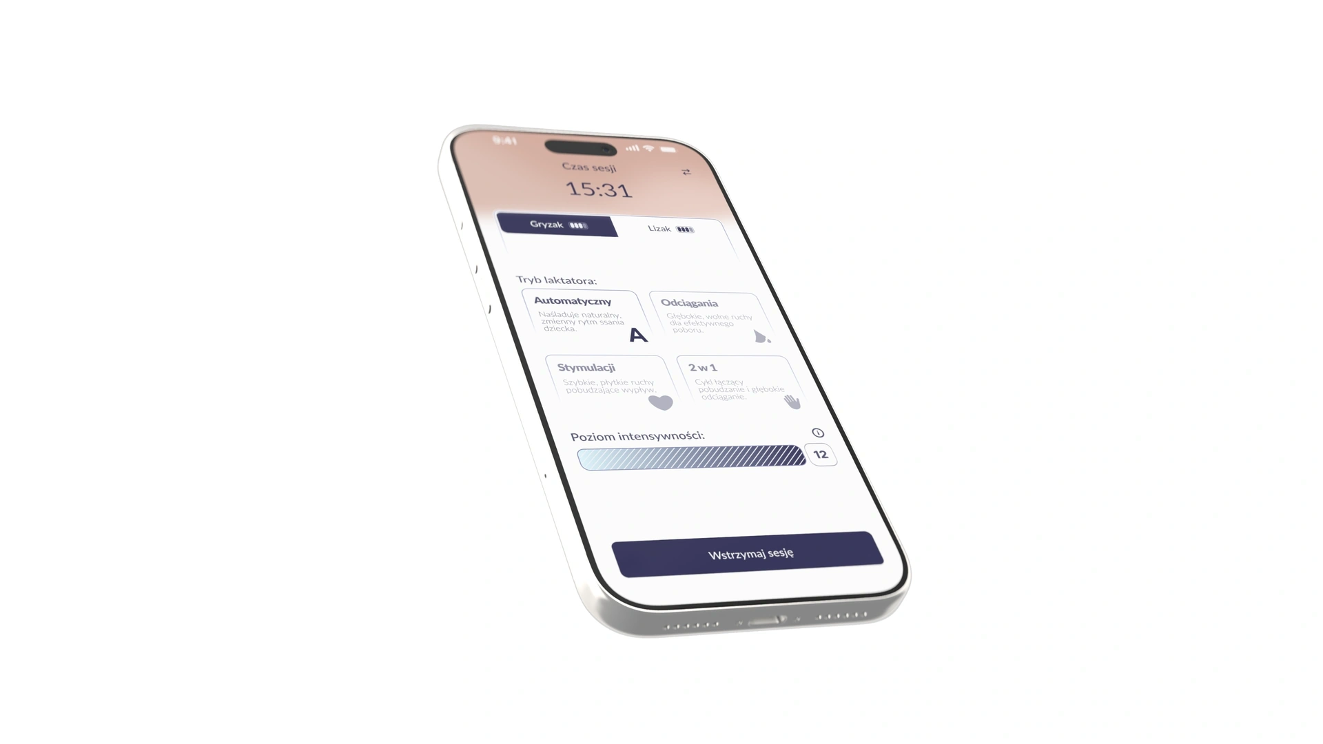
Both pump statuses remain visible while controlling either device
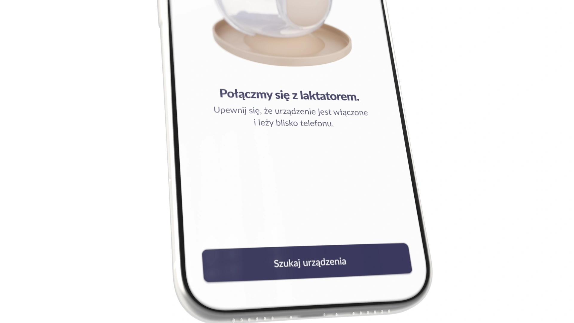
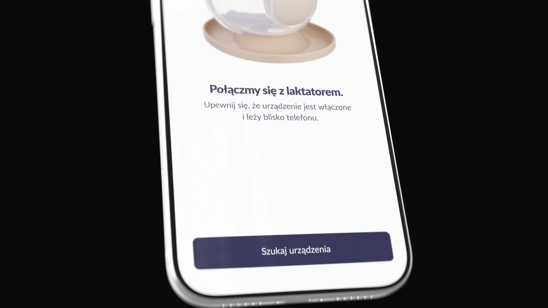
After connecting the first breast pump, the user can start a session or add the second pump. Both scenarios follow the same flow.
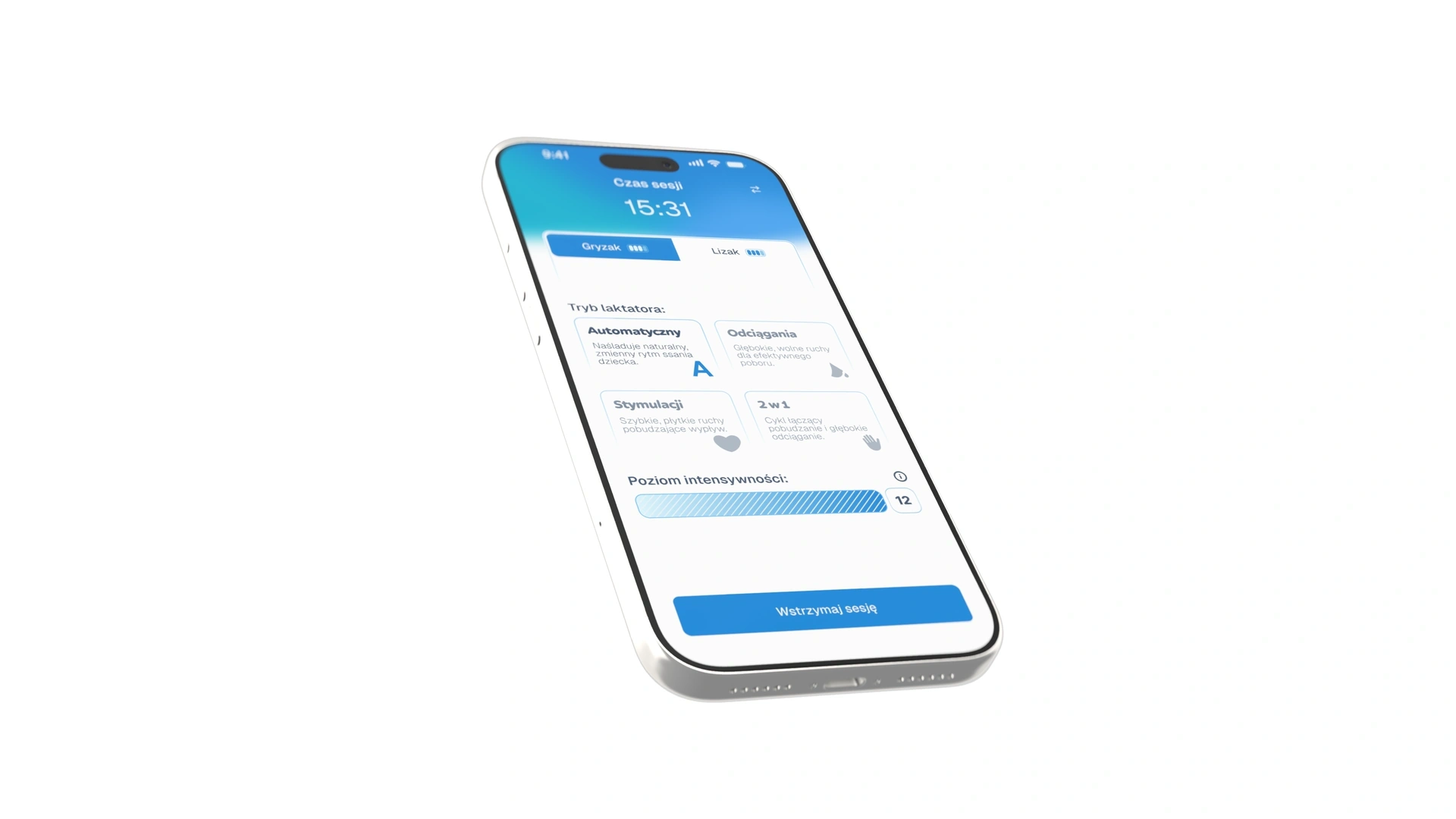
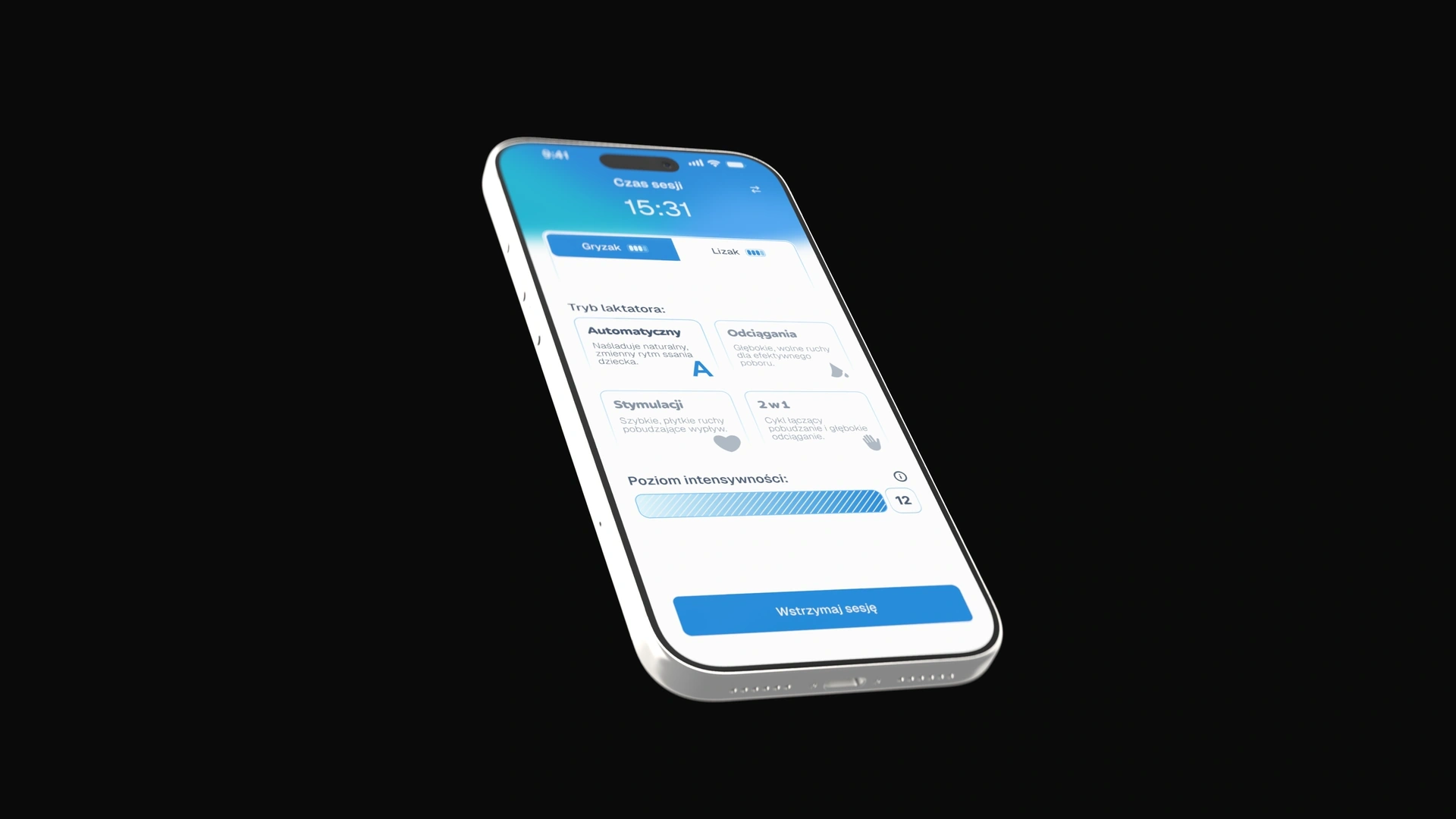
I considered a layout where switching devices changed the entire screen. I rejected it because the status of the other connection disappeared. In the chosen design, the status of both breast pumps remains visible. A tab shows which pump the mode and power controls apply to.
The interface accounts for data the device cannot provide
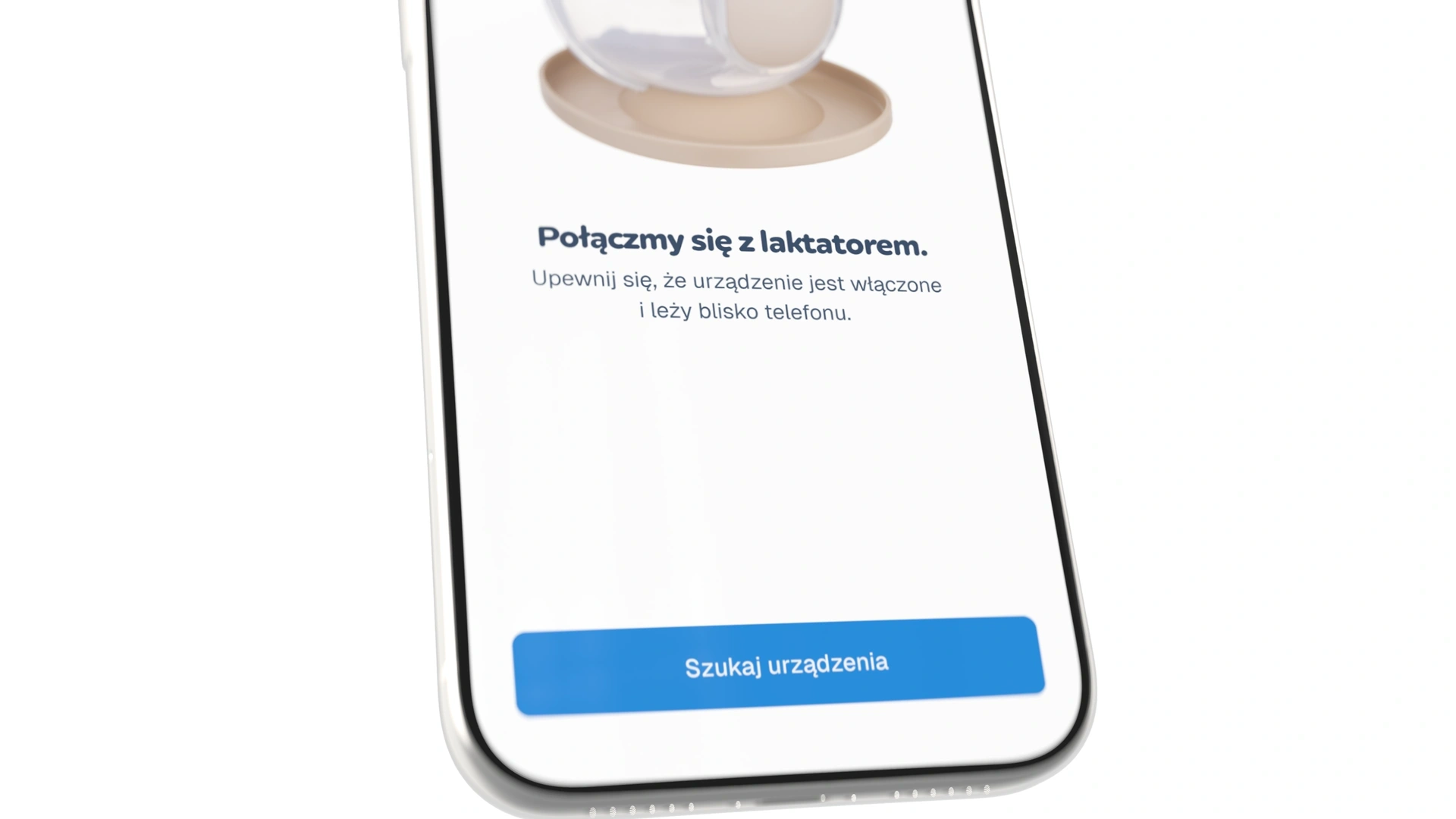
One user assumed that her two older models without Bluetooth were faulty because she could not connect them. The app could not identify a model it could not connect to. We therefore made the compatibility information more prominent in onboarding and added a visual marker to help users check their device.
We received the physical breast pumps during the project. Testing with the hardware helped me align the UI with the available data, such as a battery indicator with four levels rather than a percentage.
The summary includes data entered by the user
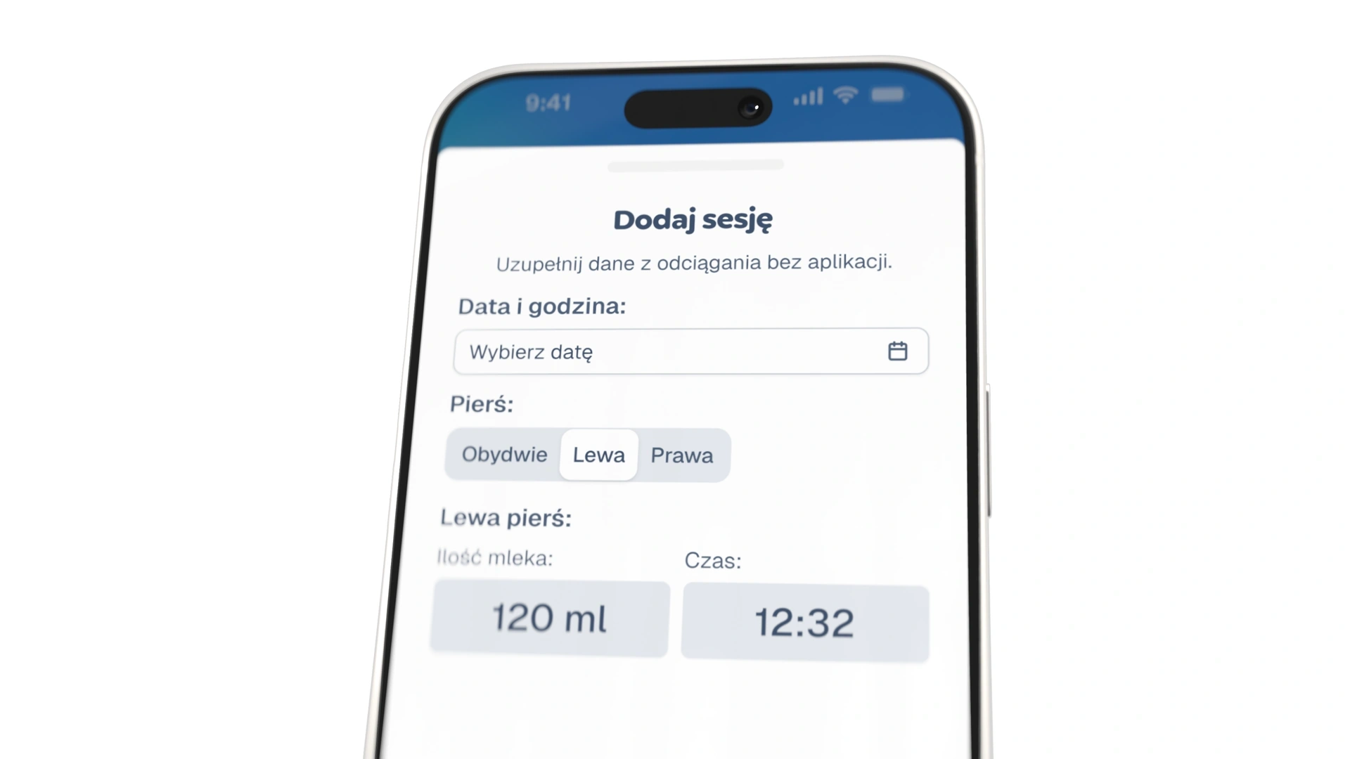
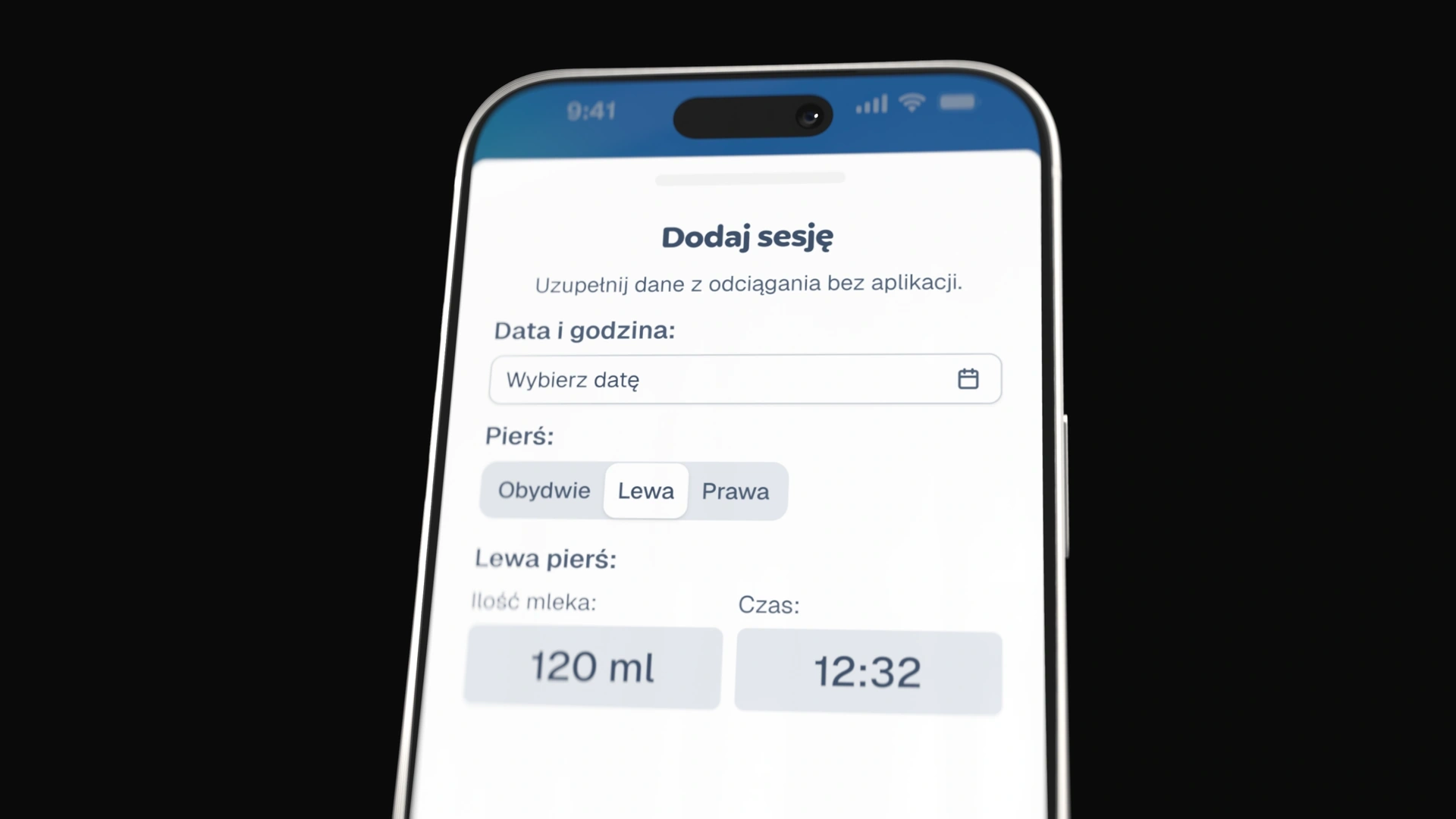
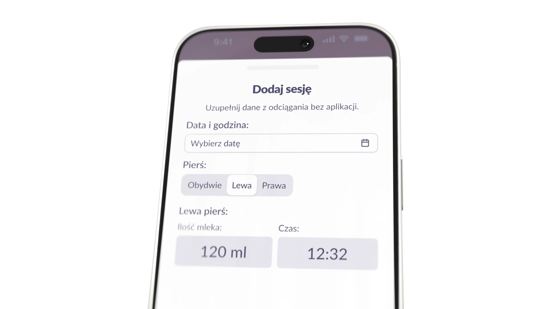
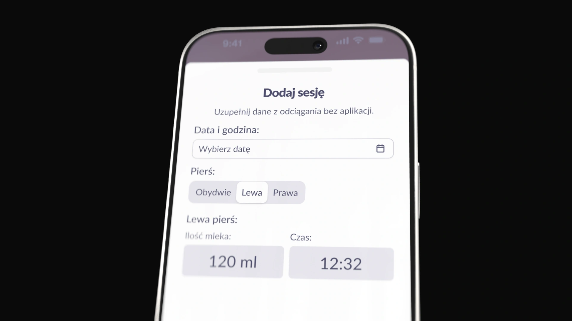
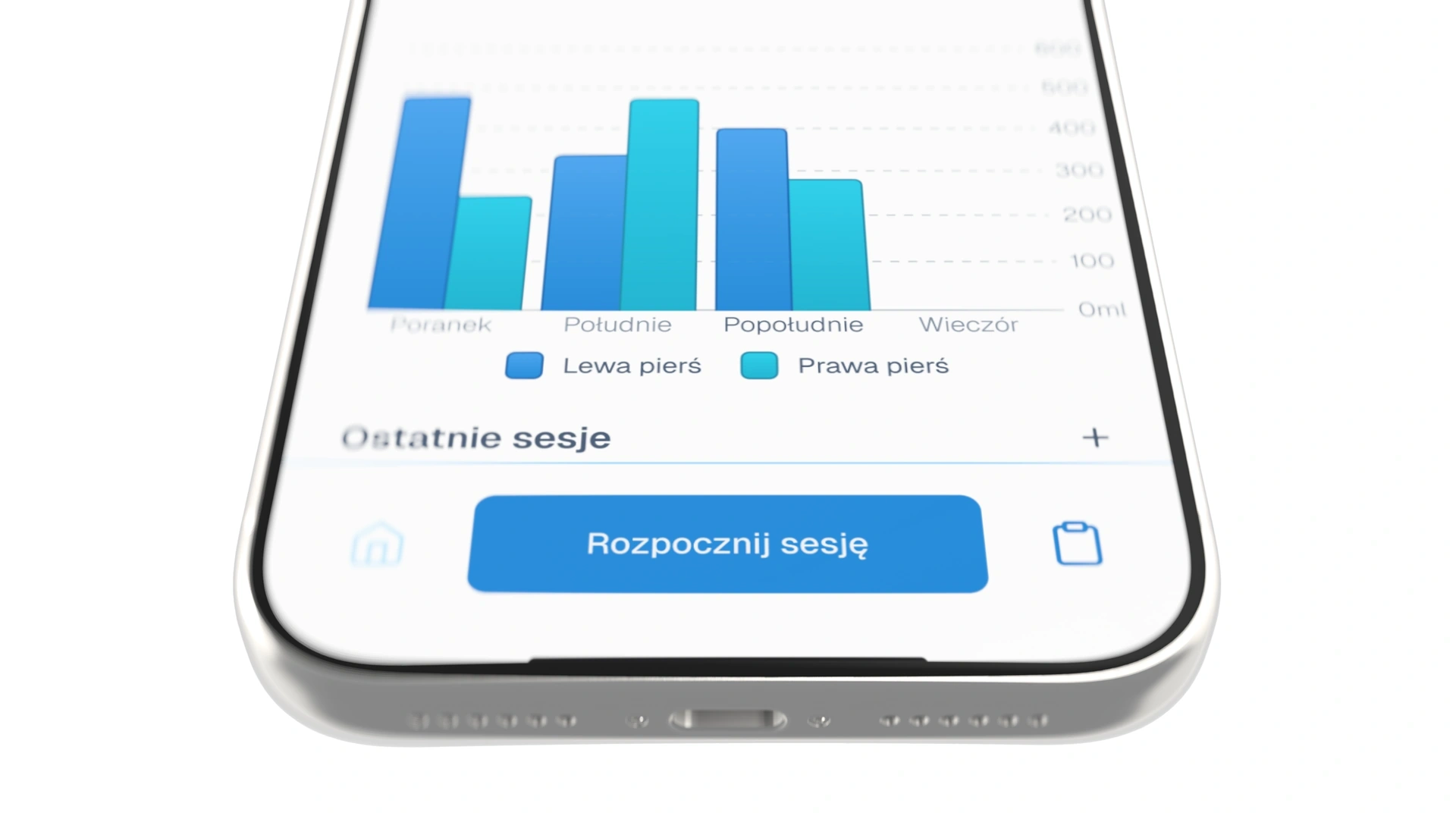
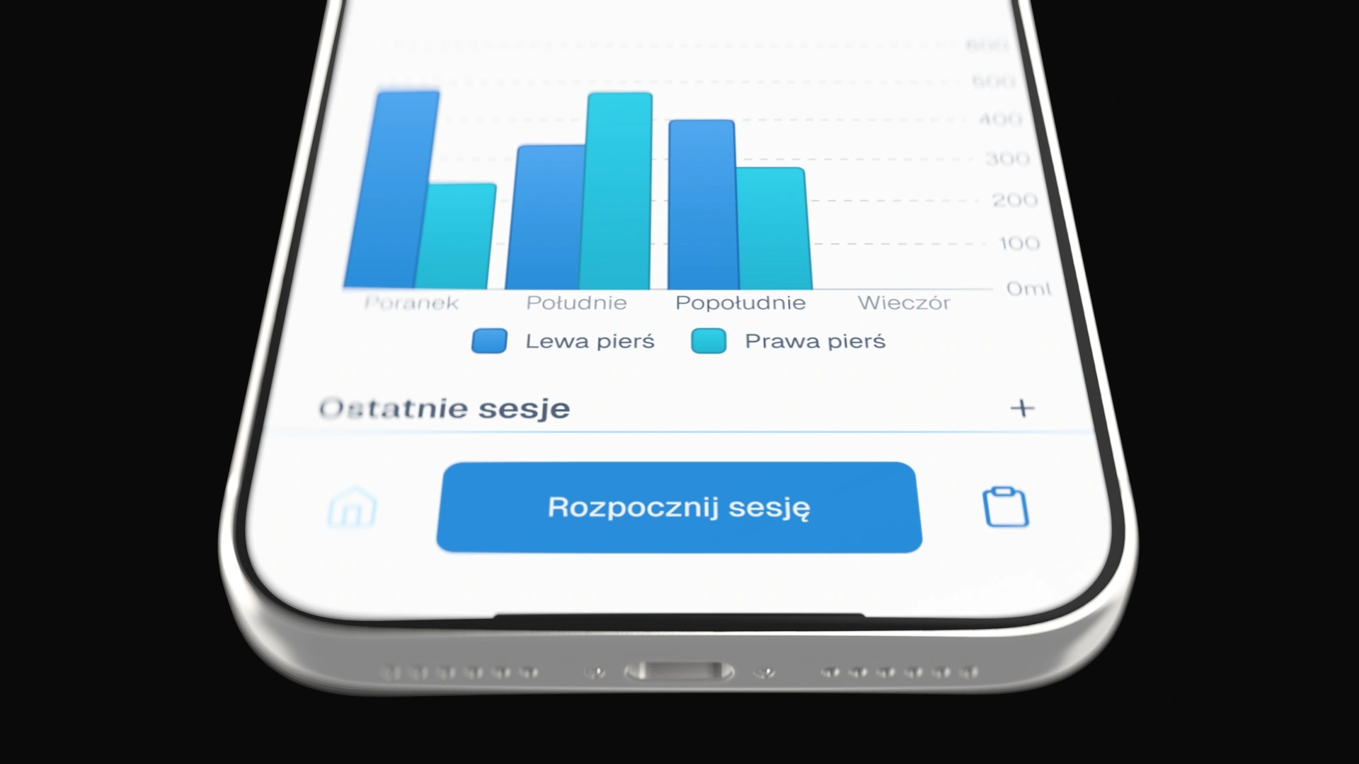
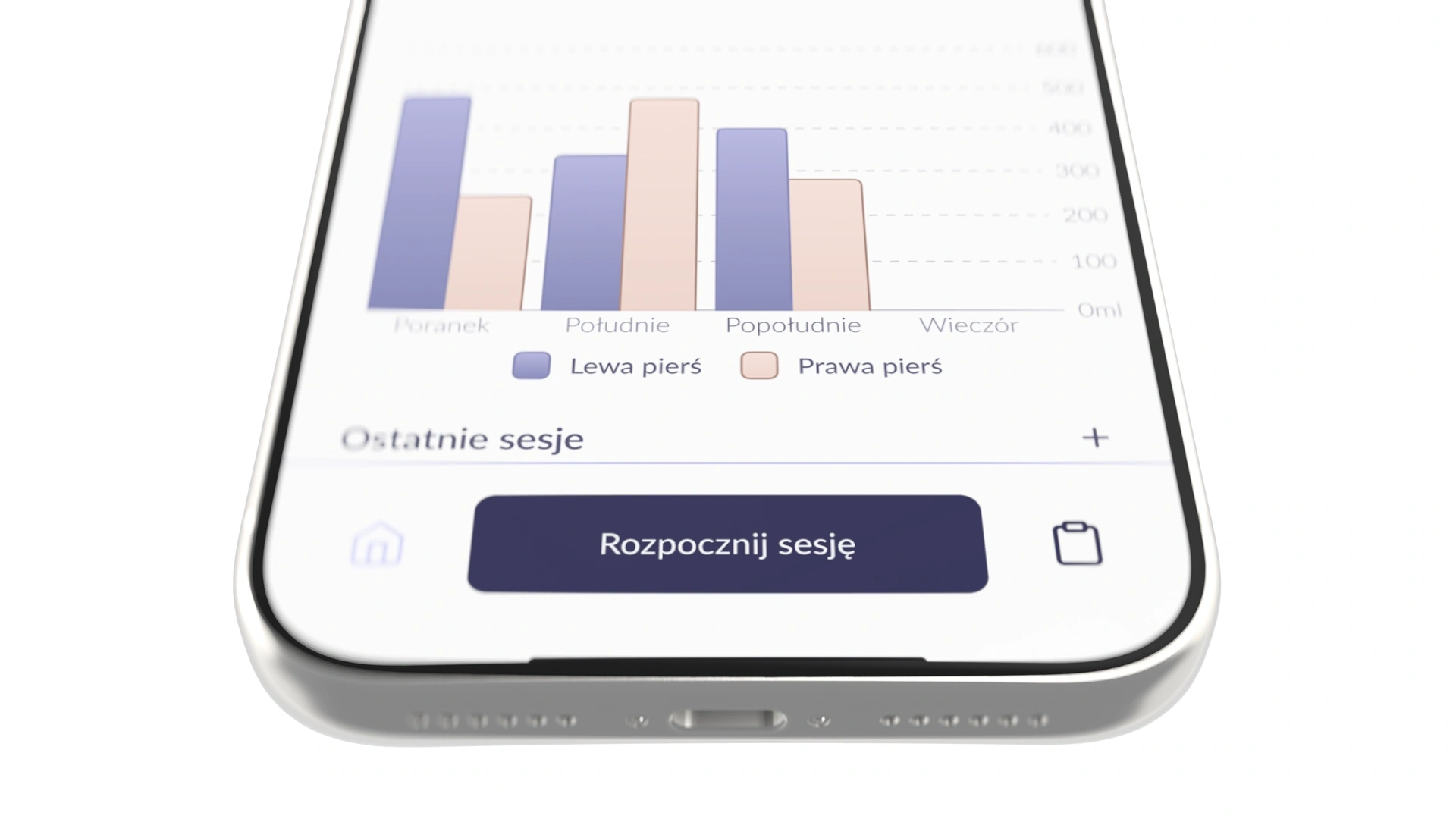
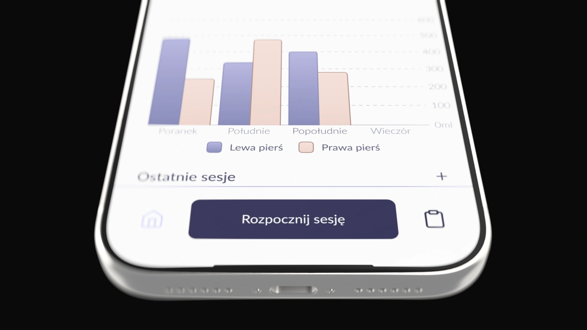
The breast pump does not measure milk volume. In the summary, the user enters the amount shown on the bottle scale and selects the breast for that entry. I designed the session history and daily, weekly, and monthly summaries. Comparisons show changes in the recorded data, while the ability to complete and edit those records is part of the flow.
Feedback had to be matched to the right app version
Canpol organised user testing. I analysed the feedback in the context of the version it referred to. A report comparing versions 1.0.0 and 1.0.1 showed, among other things, that the power adjustment gesture no longer switched the view to the second breast pump.
Later, we softened the wording of the high power warning and introduced a gradual increase to the selected power level. I do not have results from testing this change with users again.
I expanded the Design System for two separate apps
The next stage was the Difrax project. The original Canpol foundation was not prepared for changing the entire brand easily, so I rebuilt how screens and components were connected to variables in Figma.
The shared Design System covers colours, typography, spacing, and component variants. Brand modes switch the design between Canpol and Difrax. When we develop a shared component, we can use it in both versions of the design.
What I would have addressed earlier
I would have agreed on the colour direction earlier with everyone responsible for brand decisions. For the next brand, I would plan shared variables and components from the start. Before testing, I would also clarify the scenarios, questionnaire, and app version with the client. This would make it easier to separate new observations from problems that had already been fixed.